Scatter diagram is one
of the methods used in correlation studies. This is the simplest method for
finding out the correlation between variables. All the values of the two
variables are plotted in a chart in the form of dots.
By looking at the
scatter of the various dots, we can form an idea whether the variables are
related or not. A scatter diagram indicates the direction of correlation and
tells how closely the two variables under study are related. It does not
provide an exact measure of the extent of relationship between the variables;
the greater the scatter of the points, we can say that the least the
relationship between the two variables.
Use scatter plots to
show relationships between pairs of continuous variables. These graphs display
symbols at the X, Y coordinates of the data points for the paired variables.
Scatterplots are also known as scatter grams and scatter charts. Scatterplot
that displays the negative relationship between flash recovery time and battery
voltage.
The pattern of dots on a
scatterplot allows you to determine whether a relationship or correlation
exists between two continuous variables. If a relationship exists, the
scatterplot indicates its direction and whether it is a linear or curved
relationship. Fitted line plots are a special type of scatter plot that
displays the data points along with a fitted line for a simple regression
model. This graph allows you to evaluate how well the model fits the data.
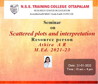
Now, Please see the poster created for the seminar on my subject


No comments:
Post a Comment